Categories
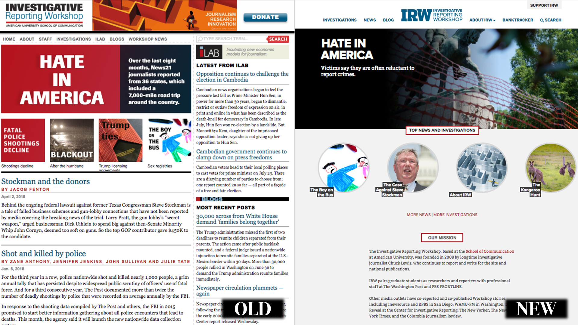
Site designWhen Chuck Lewis created the Investigative Reporting Workshop in 2008, we didn’t have anything dynamic to “show” our potential readers. We were in start-up mode, assigning those first few projects to the post-graduate fellows and reporters on contract with us, and working with a PBS FRONTLINE producer on a program in the beginning stages of research.
Simultaneously, we also spent months developing a look — for our logo, our story display, our partner outreach. We tackled the visual journalism the way we did the written journalism — exploring what would work for us and how fast we could get things done with a core group of editors and graduate students.
We’ve designed and redesigned the website over the years, sometimes because we had specific long-term projects, such as our two-year look at the economy, “America: What Went Wrong,” led by the reporting team of Don Barlett and James Steele, formerly of Time and Vanity Fair. In other instances, we redesigned to keep up with technology changes, such as creating a separate mobile site.
Now we have a new look to celebrate the 10-year mark and to showcase a responsive, mobile-first design.
All good designs begin, of course, with functionality — what do we, as editors, want to showcase; how can we make it easier for readers to find specific stories and videos; how can we make the site easy to navigate for a new reader? We hope you’ll see all of that answered as you explore our site and read new stories and projects in the coming months.
When the Workshop started
We worked with Matt Waite, now on the faculty at the University of Nebraska, to develop our original site. He was the senior news technologist for the St. Petersburg Times of Florida (now the Tampa Bay Times), and the principal developer of the Pulitzer Prize-winning PolitiFact. In 2007, he began working as a hybrid journalist/programmer, combining reporting experience and web development to create new platforms for journalism — which he did for us. Waite also is a former investigative reporter.
He was joined by designer Lisa Hill, assistant dean of communication design at Northern Virginia Community College, and herself a longtime illustrator; she helped us develop our print posters as well as website graphics to accompany stories. Eddie Sutton, a freelance developer, also devoted hours to creating easier ways to display stories, maps and photos. Hill and Sutton worked on several updates to the design over the years.
For this latest redesign, in 2017 we turned to our designer, Kelly Martin, who spent 15 years at Atlantic Media as an art director for Government Executive magazine before coming to American University for a digital media certificate and then developing his own business.
We have had the good fortune to pair Kelly’s communication-driven design with lead developer Melanie Martin, formerly of Washingtonian and the Holocaust Museum, now the chief innovation officer at the Baltimore Museum of Art. She is also an adjunct faculty member at American University, most recently teaching in our weekend master’s program.
Together, the two — who are husband and wife — have streamlined our ideas, their experience and our needs to produce a more functionally adaptable news-oriented site. We’ve made it easier for our readers to get to the news faster, eliminating redundant classifications and better showcasing our most popular features.
We still publish our own work — as well as that of freelancers on contract with us and also of our publishing partners, chief among them, PBS FRONTLINE and The Washington Post.
Among the changes we’ve instituted with this new look:
- We have new flexibility to put our important stories and content at the top of the home page, regardless of whether these are long-form investigations, shorter news pieces, or essays and analysis.
- We’ve highlighted Executive Editor Chuck Lewis’ most recent essays and reports on the home page, including this one on the power of nonprofit newsrooms.
- We’ll continue to maintain our BankTracker project, in which we track every bank and credit union in the country, with a forthcoming web app that will greatly enhance the search experience. Until then, all BankTracker links will take you to the familiar destination for stories and the individual bank searches. You can also read our 2016 report analyzing years of the research on this subject.
- We are moving to the WordPress publishing platform for our content management system, which gives a chance to more quickly train our students in a robust web production environment that enjoys wide support across media.
Investigating Power
Designer Tarek Anandan recently redesigned our spinoff site, Investigating Power, which he also originally developed. This site showcases some of the biggest “moments of truth” revealed by journalists over the last 50 years, with many of their stories changing the public conversation — and in some cases, the law — on issues ranging from the Vietnam War to smoking. The new Investigating Power site also offers more flexibility and clarity to new readers, plus recently added resources for teachers.
Lewis started the project and video interviews more than 10 years ago, and we’re continuing to build on it; we’re exploring other platforms and a potential film.


